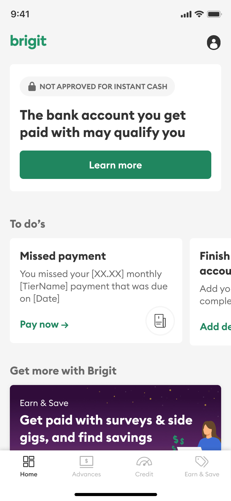
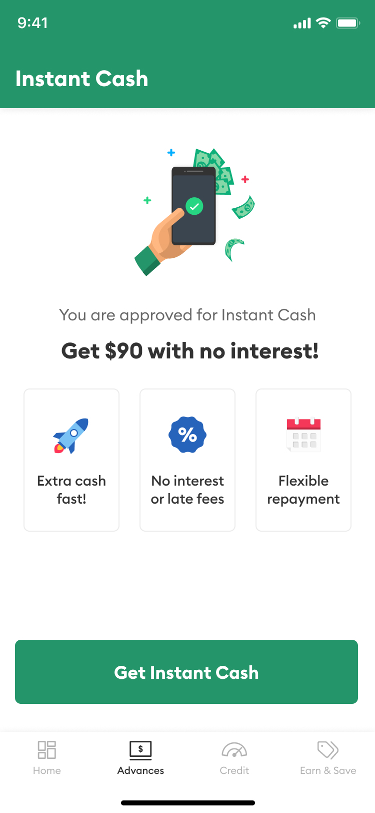
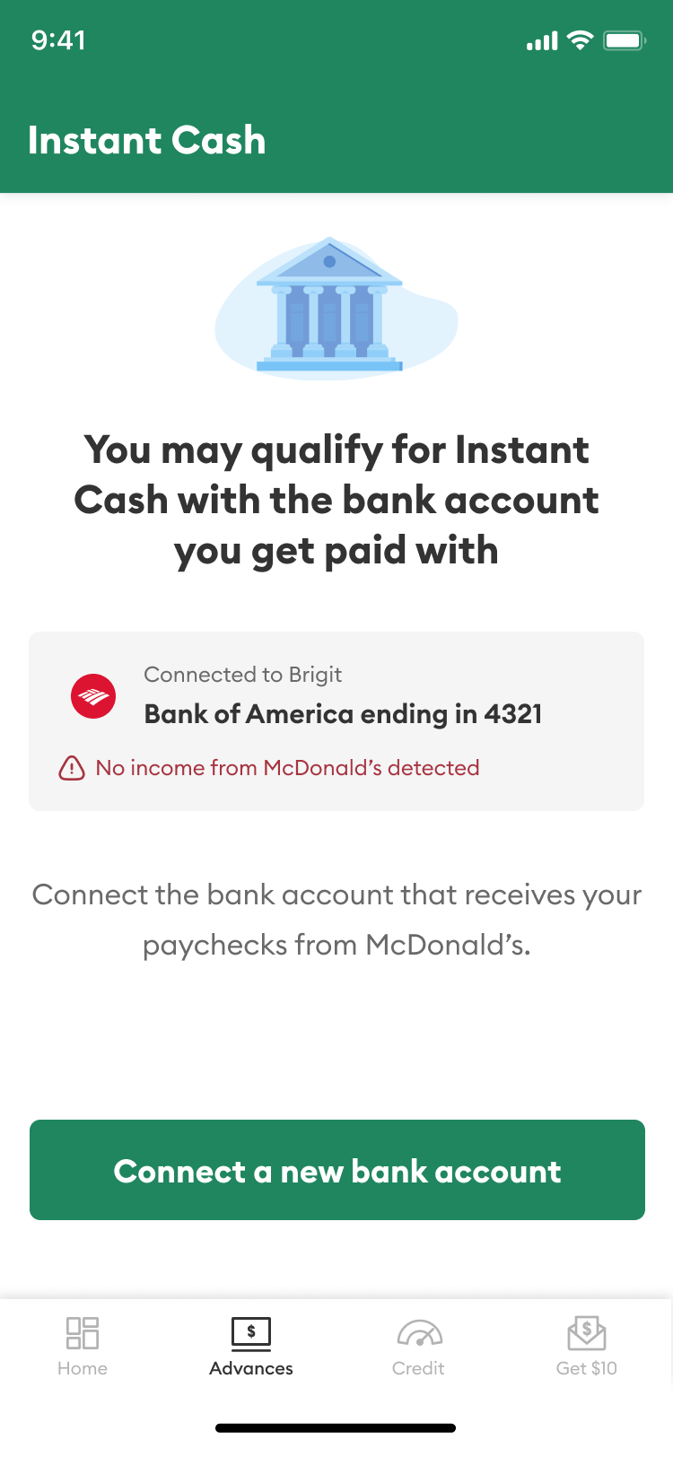
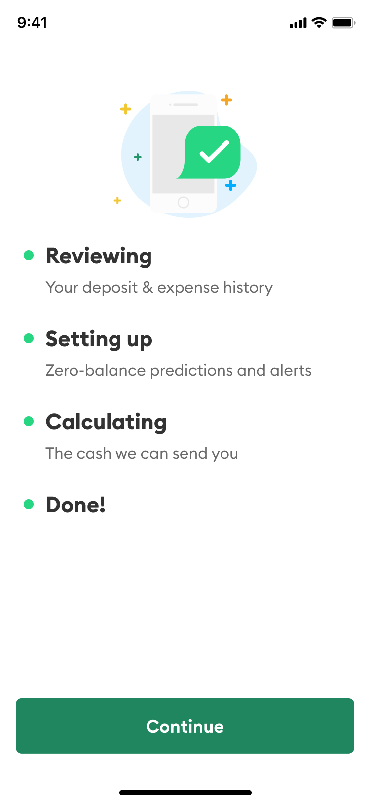
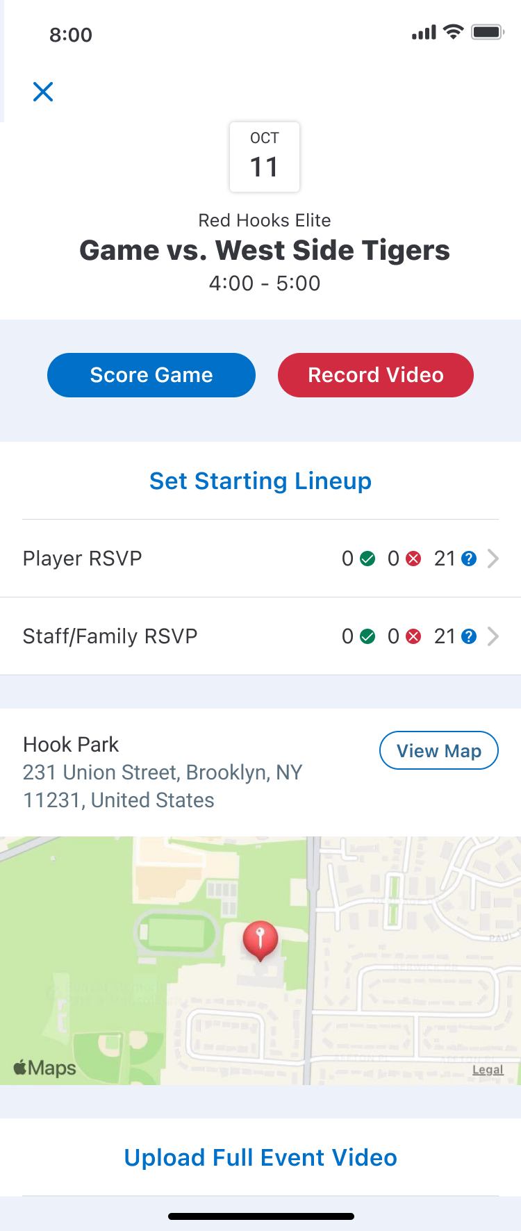
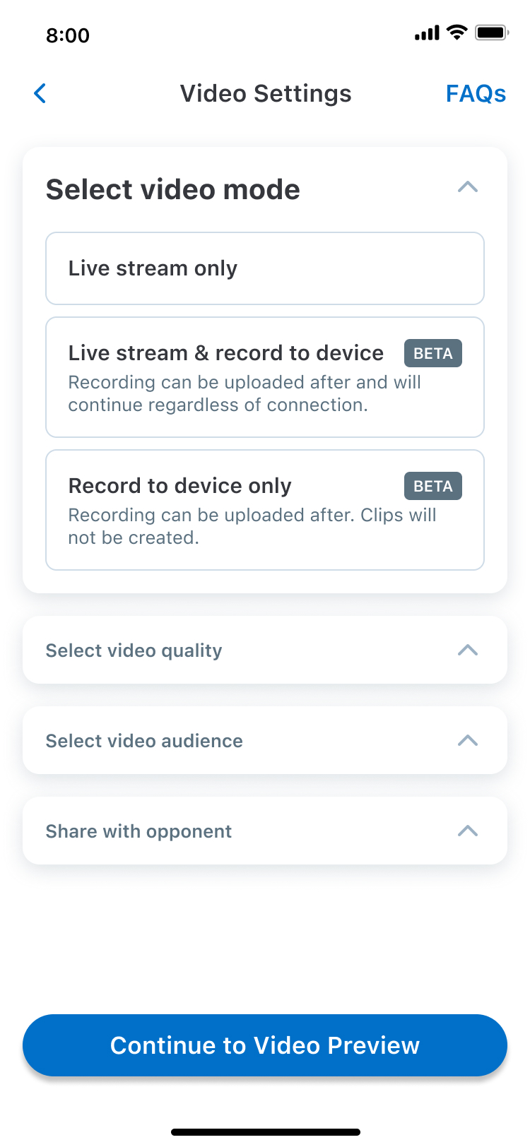
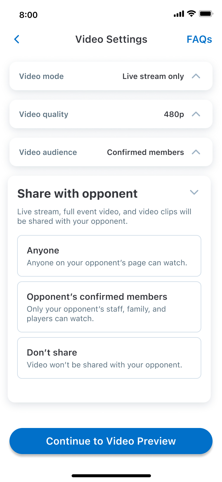
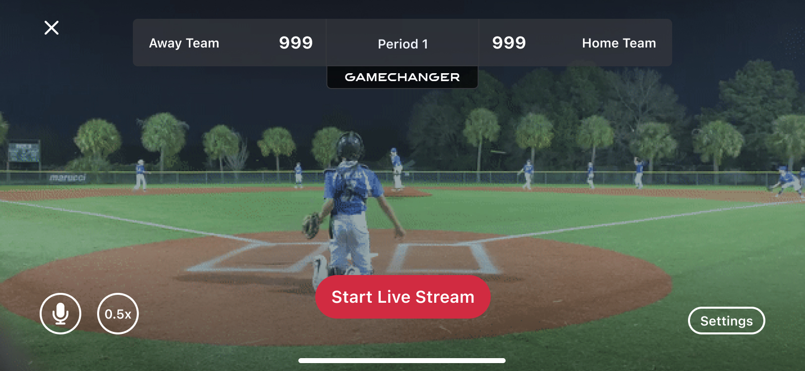
← Back to all projects
5-Day Sprint Fintech Mobile App Product Strategy

Redesigning Instant Cash qualification to reduce risk & increase approvals

Helping a fintech app approve more users for cash advances — without increasing delinquency — by rethinking the bank connection and income verification flow.

Client
Fintech App · NYC
Timeline
5-Day Design Sprint
My Role
Product Design Lead
Platform
iOS & Android
The Challenge

Approving more users without increasing portfolio risk

The company offered interest-free cash advances to users, but the approval process was leaving money on the table. Many marginal users — people who were close to qualifying — were being rejected because their bank account didn't match their direct deposit destination. The business needed a way to convert these users without increasing delinquency rates.

Business Problem

Approving marginal users without tighter controls would increase delinquency and compound portfolio risk at scale. The company needed a smarter qualification gate — not a looser one.

Design Goals

  • Increase direct deposit destination & bank match rate
  • Increase LTV for the payroll connect segment
  • Only approve marginal users with a confirmed direct deposit in their connected account
  • Test if prompting users to link a different bank shifts behavior

The Process

5 days from problem to testable prototype

01

Discovery & Data Deep-Dive

Analyzed existing user data to understand where marginal users were dropping off in the qualification flow. Mapped the relationship between bank connections, payroll verification, and approval rates to identify the biggest opportunity.

02

Flow Architecture

Redesigned the qualification logic to introduce "knockout rules" — smart decision points that route users through different paths based on their bank match status, prompting them to connect the right account instead of just rejecting them.

03

UI Design

Designed the full flow: home states for unapproved users, Instant Cash landing pages for qualified and unqualified segments, bank connection screens, payroll verification via Argyle, progress indicators, and account selection.

04

Interactive Prototype

Built a clickable Figma prototype covering every user path — from initial rejection to bank switch prompt to successful qualification. Made it testable with real user scenarios.

05

Handoff & Recommendations

Delivered organized design files, a recorded walkthrough, and strategic recommendations on which flows to A/B test first and which metrics to track for validating the knockout rules.


Impact

Measurable results from smarter qualification

Increased bank match rate for direct deposit destinations
Higher LTV for the payroll connect user segment
Reduced portfolio risk by gating marginal approvals to verified accounts

Key Decisions

What made this work

1

Rejection is a design opportunity. Instead of showing "you don't qualify" as an endpoint, every rejection screen became a conversion path with clear next steps tailored to the user's specific situation.

2

Trust messaging at the right moment. Users are most anxious when sharing financial data. Placing privacy and security messaging at the exact point of friction (Argyle connection) significantly reduced drop-off.

3

Keep both banks connected. The "maintain access on bank switch" screen was a small but critical addition. By encouraging users to keep multiple accounts linked, the system gets more data points and users get better odds of approval.

4

Progress reduces anxiety. The multi-step verification indicator (reviewing → setting up → calculating → done) turned a black-box process into something transparent and tolerable, keeping users engaged instead of abandoning.

Your turn

Have a product challenge like this?

I'll turn it into a tested prototype in 5 days.

Book a Free Call →